Congratulations, one and all, we've made it to Wednesday! I won't waste time on midweek…
In need of some whimsy on your Wednesday?
So, here is some potentially interesting or at least good-to-know information about your humble blogger:
I like interesting architecture, pretty things, and bright colors.
I have a well-developed sense of the absurd, and have been known to make up personalities and life stories for anything from public art installations to toys to ceramic salt and pepper shakers.
I take a lot of photos.
Put all of that together, and one result is that I have a lot of photographs that (I think) are cool but also a bit random. Or they’re pretty normal as travel photos go, but for one reason or another aren’t likely to turn up in a blog post anytime soon. Or they’re just flat out silly, but since I can’t stop cackling over them, I want to share.
With all that in mind, I’ve decided to inaugurate my first weekly feature, “Wacky, Whimsical, Wonderful, Wednesday.” On Wednesdays, I will post one or two “second tier” photos that I think are entertaining, and then, to maintain the illusion that I am a serious traveler and blogger, I’ll cap it off with a genuinely awesome photo from somewhere in my travels.
Why am I doing this? Because Wednesdays stink, and we all need a boost of goofiness and glamor to get us over the hump.
I hope you all enjoy!
Wacky
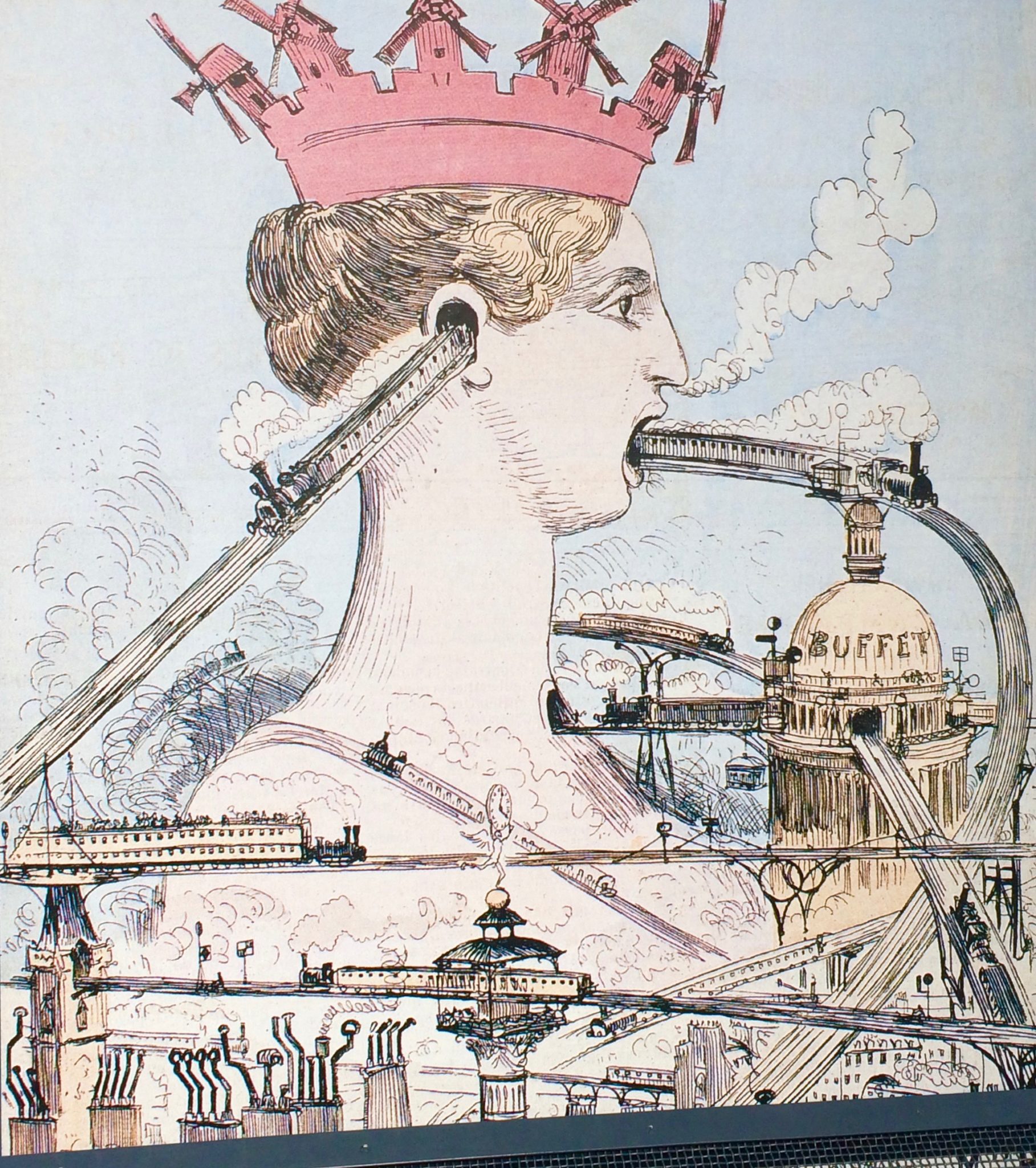
Really, your guess is as good as mine. What I can tell you is that this image was featured on an exhibition poster at the Musée d’Orsay in Paris in July 2015.
Unfortunately, the exhibition description wasn’t very clear (my lousy French was partly to blame, too, but there really wasn’t much information one way or other) and I haven’t been able to find any background on the cartoon.
From the little I could piece together, the cartoon was in reference to plans for an elevated train in Paris in the 1880s, with the allegorical figure of “Marianne” representing Paris and the “crown” on her head an allusion to the windmills of Montmartre.
If anybody knows anything about this image (or just makes up a great story about it), please share in the comments section!
Whimsical
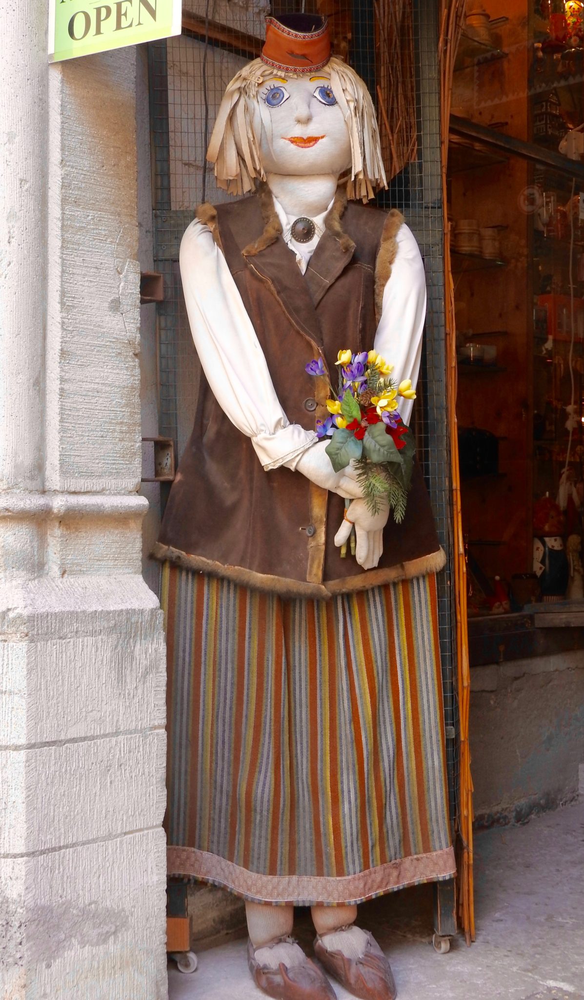
This is one of the many “door dolls” I saw when visiting Tallinn, Estonia. They stand outside of shop doors and beckon passersby, sort of like a very friendly, slightly peculiar “Open” sign. In some cases, the dolls are bedecked with the kind of goods customers would find in the stores (especially knitted items).
Estonia is the only place where I have seen something like this, but I don’t know that the tradition is unique to either Estonia or to the Baltic region more generally. I do know that in “door doll” division of the Great Doll Debate (are dolls creepy, or are they not? Discuss), I am coming down on the side of not creepy. She just seems so friendly, and even a little shy, like she’s happy to help but isn’t going to bombard you with attention or otherwise get in your face unless you ask her a question.
Having said all that, I am not sure how I would feel if I woke up in the middle of the night and saw her sitting in the chair beside my bed. In that case, I might have to change my vote.
Door dolls, yay or nay? And where do they belong the “creepy doll” scale?
Wonderful
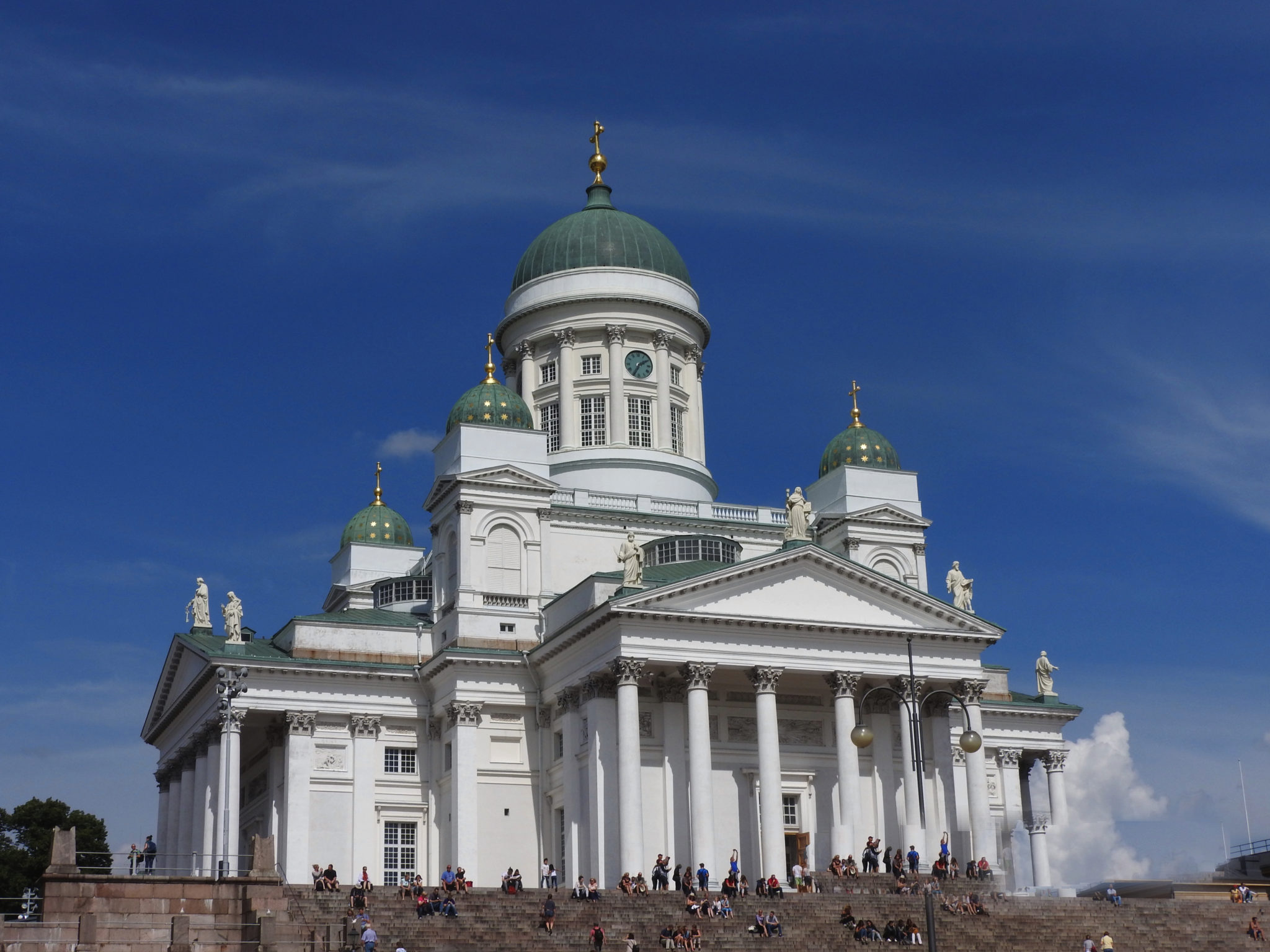
This is Finland’s Helsinki Lutheran Cathedral. Originally called St. Nicholas’ Church, it is one of two cathedrals in the city.
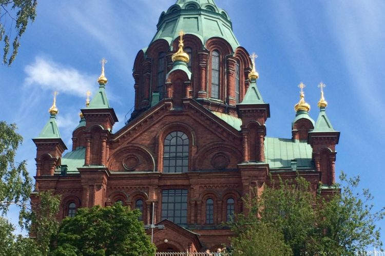
The exterior of the cathedral is beyond beautiful, with its neoclassical facade and bluish-green onion domes. But I find its appearance is a little strange, especially when considered alongside Helsinki’s other cathedral, Uspenski Finnish Orthodox Cathedral (that’s the photo at the top of this post).
Helsinki Cathedral was built on the site of the smaller Ulrika Eleonora Lutheran church. The design–which is very Orthodox in flavor and not really something one would associate with Protestant northern Europe–was supposedly commissioned to honor Russia’s Tsar Nicholas I, in his capacity as Grand Duke of Finland (Finland was under Russian rule from 1809 to 1917).
The Russian connection is presumably why the architect, Ernest Lohrmann, a Finn of German extraction, decided at the last minute to add the onion domes. Lohrmann said he was inspired by St. Isaac’s Cathedral in St. Petersburg, another neoclassical masterpiece (but one that was actually Orthodox). Okay, I get that. Sort of.
Maybe Lohrmann just really liked Orthodox motifs and, deciding that this was his chance, just ran with it. Helsinki isn’t a very a large city; perhaps he assumed this would the only opportunity to design a cathedral there for decades to come.
But if that was the case, Lohrmann must have been annoyed when, barely a decade after “his” cathedral’s completion, the Russians built an actual Orthodox cathedral (Helsinki’s Uspenski Cathedral) halfway across town, and commissioned an actual Russian to build it.
But this actual Russian (who had an actual name, Aleksey Gornostayev), seems to have been less enamored of traditional Orthodox design than Lohrmann. Uspenski Cathedral is beautiful, but, as you may have noticed, much more subdued in its exterior design than its Lutheran counterpart.
So, Helsinki has an “Orthodox-looking” Lutheran cathedral and a “Protestant-looking” Orthodox cathedral. Hmmm. Maybe it’s just a fluke, or maybe I should have put this under “whimsical,” and moved the door doll to “wonderful?”
What do you make of this (very minor) tale of two cathedrals? Which one do you like better?

Comments (0)